Guide to Select Perfect Colour Pallette for Your Home
Selecting the perfect color palette for your home in interior design in KL should combine personal preference with design principles. It begins with the foundational choice of a neutral base color then introducing accent colors. As design trends beckon with alluring palettes, it’s important to ensure they align with your own unique tastes and long-term satisfaction. This ensures a color palette that not only appeals aesthetically but resonates on a personal level.
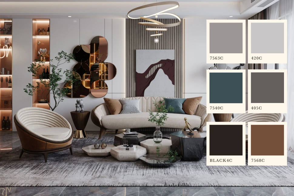
1. Neutral base colour
This foundational hue, such as whites, grays, beiges, or soft pastels, serves as the primary backdrop. Neutrals offer versatility, allowing easy coordination with various accent colors and decorations. They create a balanced canvas, toning down bold accents and providing adaptability for long-term enjoyment. Lighter neutrals expand the sense of space, while darker ones add coziness. Undertones with warm or cool nuances influence the overall ambiance. Ultimately, a neutral base color sets the tone, harmonizing with furniture, fabrics, and artwork, and providing a timeless foundation for visually appealing interior design.
2. Accent colours
These secondary hues serve as dynamic complements to the foundational neutral base color, infusing vitality and character into the room’s design. By strategically placing accent colors through furniture pieces, artwork, textiles, and decorations, you create focal points that breathe life into the space. These bold, contrasting tones introduce an element of drama and visual intrigue, fostering a stimulating environment. However, it’s crucial to strike a balance. Although it adds excitement, they should harmonize with the overall color scheme. Thoughtful selection allows accent colors to work with the neutral backdrop, resulting in a harmonious and visually attractive interior.
3. Approach design trends carefully
While trends can be innovative color combinations, it’s crucial to weigh their appeal against the backdrop of your own personal style. Trends are transient and might not stand the test of time. This is where the Suzuka cement painting effect can play a distinctive role. This specialized painting technique offers a textured finish that exudes sophistication and depth, introducing a unique layer of design element. If you’re drawn to a particular trend, consider how to tailor it to suit your existing space, whether through accent pieces or temporary applications that allow for future adjustments.
In conclusion, the selection of colors in interior design Selangor goes beyond aesthetics—it’s an intimate expression of one’s individuality and comfort. By intertwining all these elements, a harmonious and visually compelling color palette emerges, creating a space that not only looks beautiful but also feels like a true reflection of your unique style and personality.